Chernoff Faces in ESRI#
• Author: Tayebe Sadat mousavi
• Contact: tayebemoosavi@mail.um.ac.ir
Do You Know Esri Company?#
Esri is the global market leader in geographic information system (GIS) software, location intelligence, and mapping.
ESRI users#
Over 650,000 customer organizations, including 90% of Fortune 100 companies, most national governments, 30,000 cities and local governments, all 50 US states, and 12,000 universities.
The Story Behind the Map#
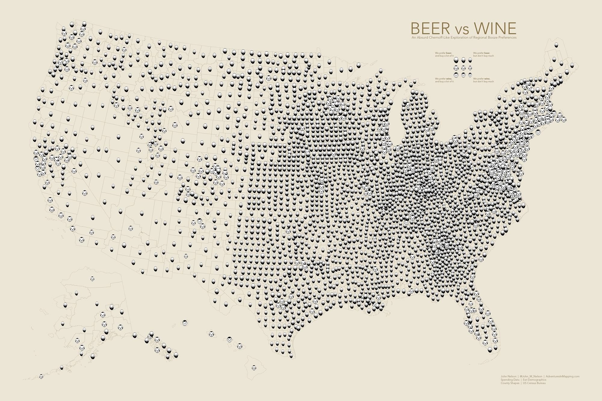
John Nelson, working at ArcGIS Living Atlas in Esri, seeks ways to visualize and present data in an engaging manner. He created a map that displayed whether more money is spent on beer or wine per person in America. For this, he used consumer spending data from Esri Demographics, calculating the per capita cost for both beer and wine.
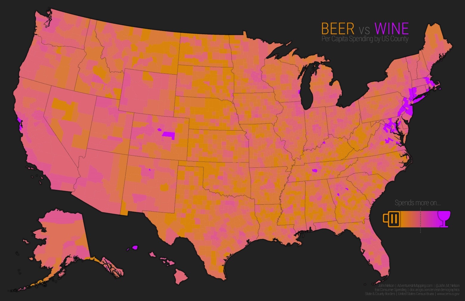
But this map had problems. Some places may really prefer beer or wine, but that doesn’t necessarily mean they buy a lot of it. It’s time to make the map fairer.
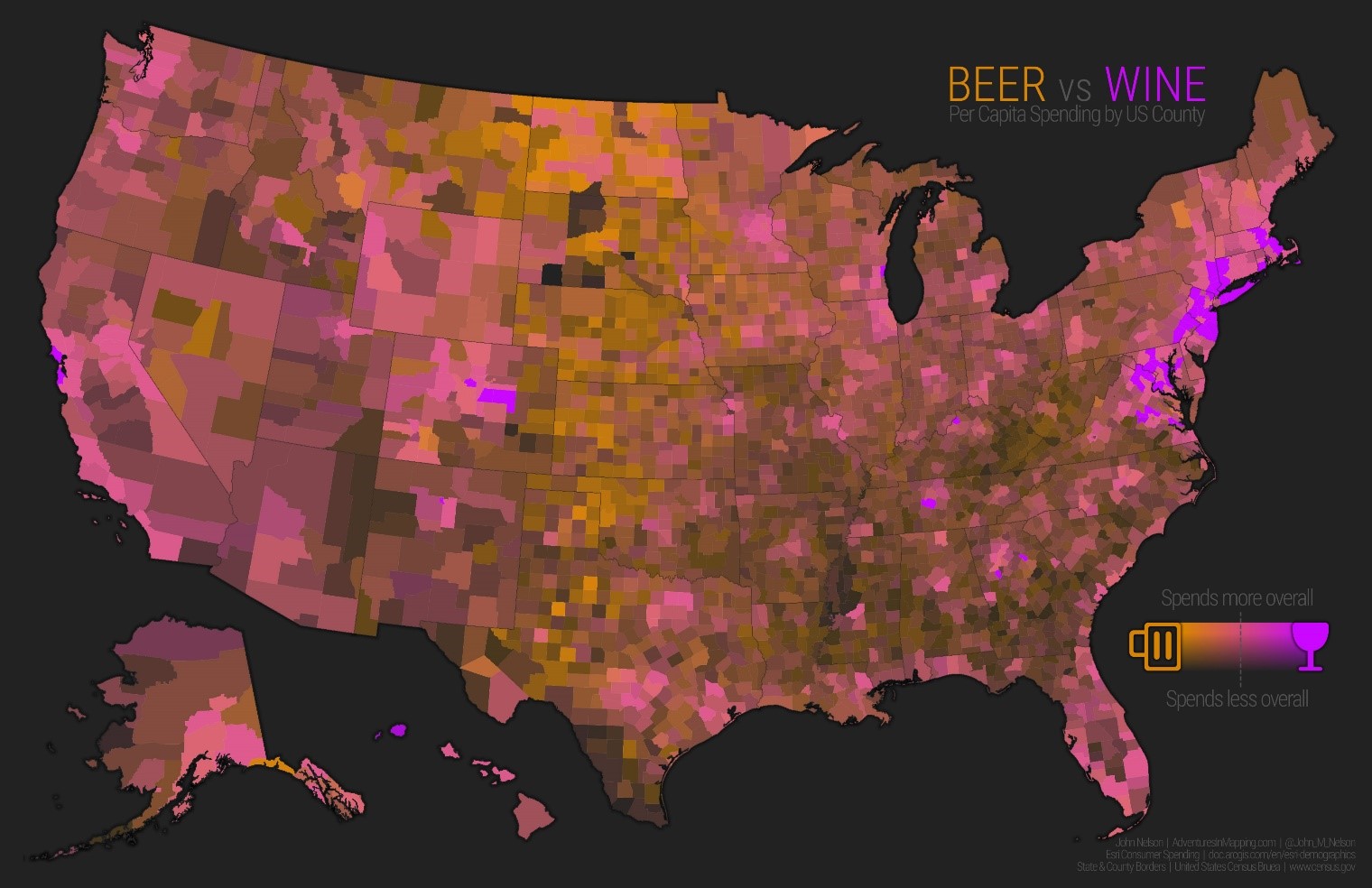
Using Chernoff Faces for Data Representation#
Now, on another note, John Nelson wants to use Chernoff faces and display information in a different way. Data is a very simple combination of two things… • Relative preference for beer or wine • How much they cost
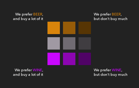
Here we have 9 small and neat groups.
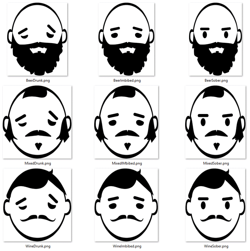
And a map similar to Chernoff
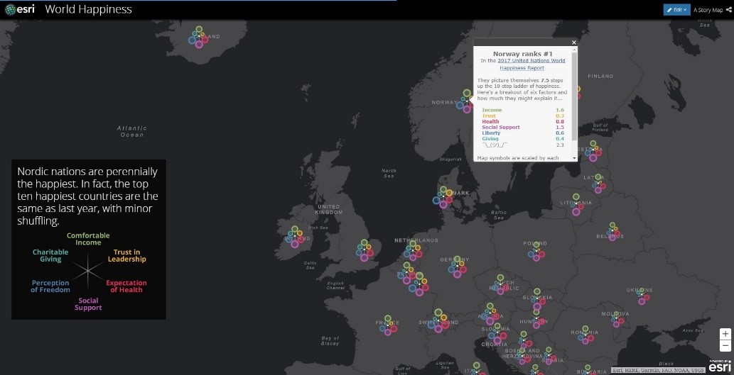
Next, Nelson adds United Nations’ World Happiness Index data to his map.For most of the countries in the world, the UN tries to statistically derive some of the reasons for survey results of how happy people in each country are. There are six factors they consider. Plus the overall happiness score. A more standard multivariate map might look like this…
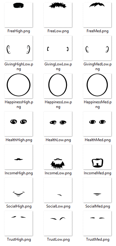
But notions of “standard” carry little weight in the world of Chernoff faces So instead of talking about graded circles, he plotted some facial features for six happiness factors (plus overall happiness, so seven), each with a high/medium/low type. 21 pictures must be drawn.
The map display changed.
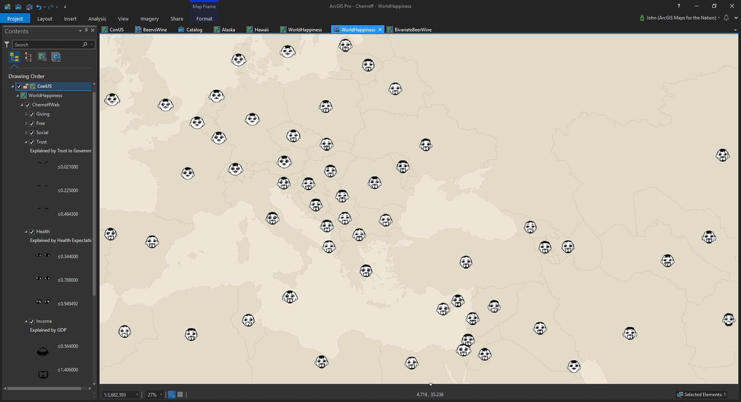
According to Nelson, Chernoff’s map are potentially problematic. Although in some cases, for example, the relationship between the state of the eyes and the person’s health seems logical, in many cases, the features are not related to the emotion conveyed by the face, and again we are faced with a completely abstract representation of the data. Additionally, some facial expressions can be due to race or ethnicity. Heather Rosenfeld has done some interesting work in trying to obfuscate potential interpretations of gender and race by making zombie Chernoff faces.
conclusion#
The use of Chernoff Faces in maps can be both useful and misleading.
References#
https://www.esri.com/en-us/about/about-esri/company
https://www.esri.com/arcgis-blog/products/arcgis-online/analytics/beer-vs-wine/
